
PROJECT : HYENAS
ROLE : UI Artist
ROLE : UI Artist
DURATION : 2 Years
Announcement Trailer
Project Overview
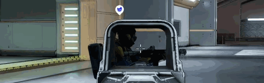
HYENAS, was a planned hero-based, multiplayer extraction shooter from Creative Assembly and SEGA
Team up with your pack to steal priceless pop culture loot from the Mars billionaires and rival crews. Use unique skills and abilities to face-off in fast-paced battles in bid to secure your stolen merch, ESCAPE TO WIN, BABY!


Role & Responsibilities
User Interface Artist
My major contributions as UI Artist carried me through the full design pipeline from proposal & ideation to prototyping & iterations to implementation within Unreal Engine4.
Typography


Branding
Some of the key identifiers for our games branding were BOLD, IRREVENT, BOMBASTIC, SCIFI, PUNK. We went through a few mind mapping sessions to pinpoint related ideas to our key identifiers and pinpoint characteristics that we could look for in a typeface to communicate these values.
We settled on HURME GEOMETRIC as it met key features we desired. The Font family was diverse and provided various styles and weights allowing more creative freedom.
It being a san-serif typeface helps align more with our target audience and platform. Sans are also good for readers with certain visual impairments.
Hurme also supports 135 different languages extending our accessibility to a more diverse background of potential users.

The Accessibility of Words
Legibility
To ensure legibility we limited our use of the font to Semi-bold, Bold and Black
With our smallest point size for text capped at 14pt.

To test the usability we had test groups monitored and timed as they read a 200 word paragraph in a universally recognizable typeface - Arial and then Hurme Geometric to compare times. This was done in 4 languages: English, German, Russian and Chinese with native speakers.
We made note of any comments or reactions users exhibited while participating in the test around difficulty making out words and viewing text.
Readability
In collaborating with our writing and copywriting teams we outlined guidelines and key metrics to ensure readability. We measured our KPI via reading level - our standard, an 8th Grade level to be accommodating a wider range of competency and level of educational achievement.
We employed the Flesch-Kincaid Grade Level test automated system built into Microsoft Word to test that we met and maintained our goal.
Our main take away was to be mindful of length/complexity of words, as it also ensured parity between languages as certain terms don’t have direct equivalents.
Comprehension
When addressing comprehension standards we leverage a lot of the considerations made earlier for legibility and readability.
Ie being direct and concise with body text across our UI.
As well as pairing icons and images to better explain concepts.
During monitored and unmonitored usability tests we measured for key KPIs such as Time on Task and
User Error rates to gather data on how effective our comprehension guidelines truly were.
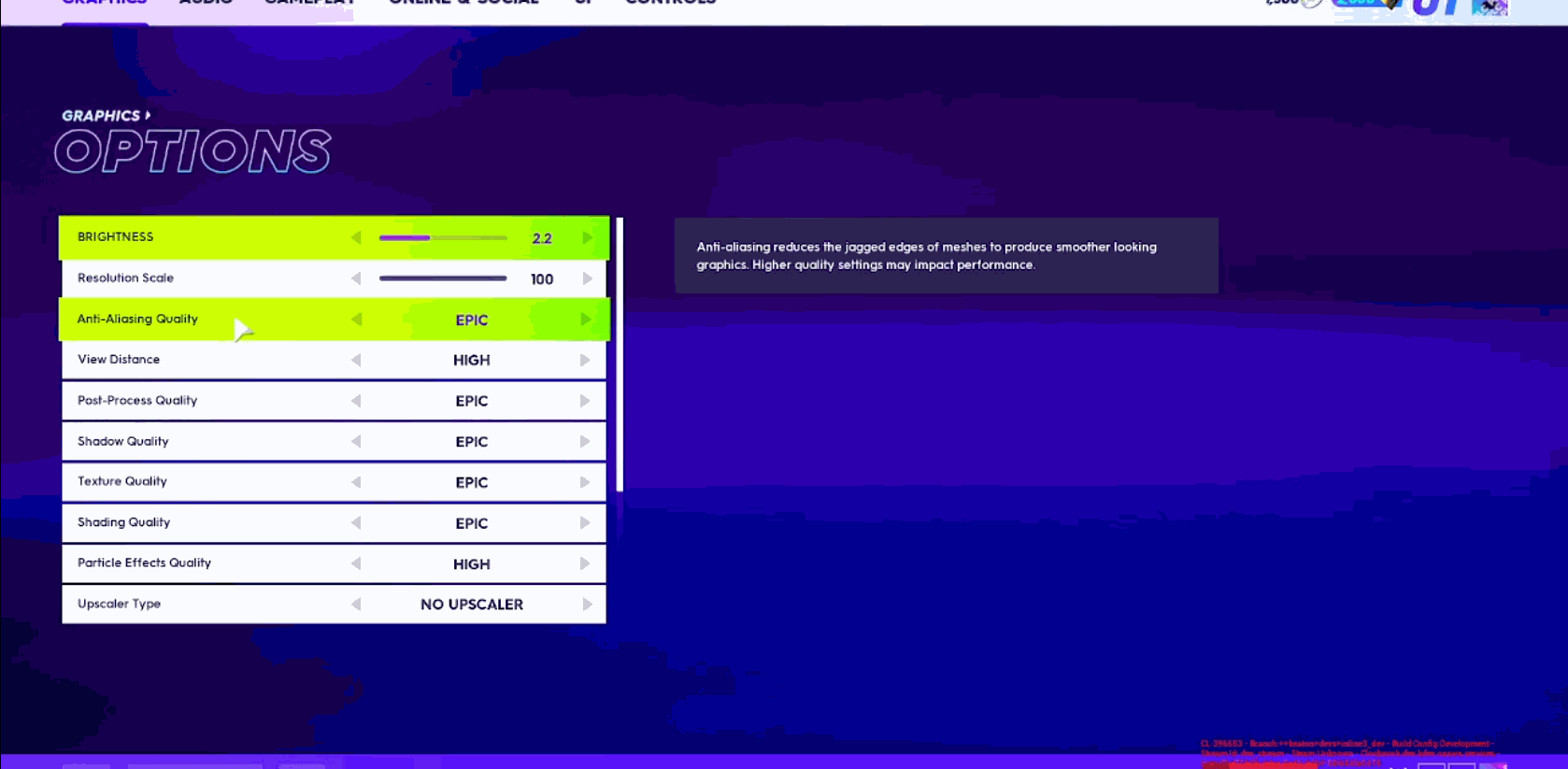
Colour Palette
As always, the goal of designing a great user experience is to make people’s lives simpler and better.
By following accessibility guidelines such as WCAG and designing with accessibility in mind we ensured the palette for our visual style was equitable, enjoyable and useful.
Considering that many users may have difficulty perceiving certain colours or colour combinations as well as the fact colours communicate different things across cultures and backgrounds, our selection went through a few iterations.

The Accessibility of Colour
Colour Blindness
It can often be a challenge for users to identify and distinguish certain colours. We employed a Colour Blindness Simulator to help us address the three common categories of colour blindness.

Low Contrast Sensitivity
Something we were adamant about was avoiding certain colour combinations when choosing our palette and deciding where they’d be used. This consideration crossed over with helping us be mindful for colour-blind users as we stuck with min- high contrast combinations. This improved the overall clarity and readability for all users
We employed WebAims Contrast Checker tool to ensure we met WCAG AA contrast standards of at least 4.5:1.

" What kind of visual style should icons have to be cohesive with our brand? "
Iconography
Teams
My first major milestone tasked me with overhauling the visual identity of the team's icons. From the offset the idea proposed to me was those ‘emojis’ along with a first pass draft from a previous artist. To build upon and adapt this concept I start off with light visual reference research.

A proposal and style guide was drafted for establishing the new visual language for our emoji set, along with a small sample set.

Emoji icons Sample
Further down the timeline there was an initiative to shift away from emoji based icons. We engaged in a few rounds of brainstorming examining varying approaches with an emphasis on shape language to address readability concerns based on aggregate data gathered during internal playtests.

icon Exploration Sample
A decision for the theme of the icons was made by the Art director. My final task was polishing and iteration led by the feedback gathered during our tests.
Grid & Keyline : Shaping Identity
My main design goal was to select a suit of shapes that would aid in user recognition and information retention by leaning away from complex polygons while having distinctive differences in their overall shape.


Standard icons are created as 24dp x 24dp.
Additionally icon are supported to be displayed at 40dp x 40do.
24 DP
40 DP

The icon grid establishes clear rules for consistency but allows room for flexible compositions and shapes.
" Keyline shapes are the foundation of the grid. By using these core shapes as guidelines, you can maintain consistent visual proportions across system icons. "
- Google Material Design
Style : Colour
Most primary & secondary colours had at this point been established across more prominent Front-end and HUD elements. Along with consideration for what those colours communicate to users on a psychological level, those chosen for the icons were not allowed to overlap to avoid confusion and to align effectively with user expectations and understanding.
Colour Swatches

Colour exploration approach of a multi-colour gradient was proposed based on the branding of real-world sport teams and design.


Team Icons in-game
Gadgets
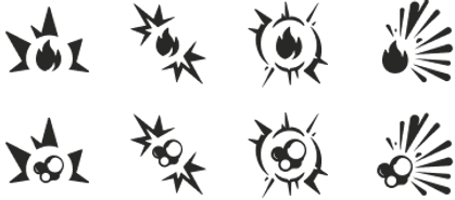
The milestone for this task was split between Throwables and Consumables.
Building on previous iterations of these in-game gadgets, I prioritized a form-follows-function approach to strengthen the intuitive connection between each item's design and its intended player interaction. By incorporating familiar visual signifiers, I ensured each gadget’s utility was immediately recognizable and easily understood.
Throwable Gadgets
Sketches were drafted to solidify style concepts and aid in communicating with my team during the concept phase.


The designs were further iterated upon and adjusted as the art style progressed.

Final Gadget (throwable) iteration
While designing our rarity system our mission statement was, How can we refresh the way we communicate a system that is so universally understood across the gaming landscape, while keeping it equitable, useful and useable for our users.


The pitch for the visual style was that of a holographic foil approach borrowing the signifiers from real world stickers and trading cards, with previous rarities incorporating their colours in the final gradient.

A mesh of nodes and curved shapes were used to define the sides of the grid. This enabled a smooth transition between colours along vectors between nodes to create gradients.

%201.jpg)
in-game HUD
Consumable Gadgets
Research for consumables was conducted in parallel with throwables to ensure consistency across gadget categories. I applied a form-follows-function approach, leveraging the visual shape and design of in-game models to reinforce each item's intended use. This strengthened player recognition and fostered a cohesive, intuitive gameplay experience.
Iterations were made as the in-game models developed and the pickup gadget system was overhauled. The remainder of the work on this milestone will further be displayed under ‘ in-game Branding’ .
Ranks
Ranks for grading player performance in game and standing amongst the player had two sets of icons drafted. These followed a badge motif and a similar teired hierarchy found in other competitive titles (such as League of Legends and Apex Legends).


Perks
Character perks were introduced later in development, requiring a new set of icons and supporting menus. By this stage, we had established a clear and effective approach to icon design, allowing me to create visuals that aligned seamlessly with the existing system while clearly communicating new gameplay mechanics.
I drafted a design specification that emphasized subtle rounded features and clear action indicators, applying a form-follows-function approach to ensure each element visually communicated its purpose. By building on the design language established with the throwable gadgets, this approach reinforced usability, consistency, and immediate player understanding.

Menus & Popups
I led the development of the visual language for the project's in-game menu popups, setting the foundation for a cohesive user experience. I also built a component library to streamline prototyping, while continuously documenting, updating, and presenting design system enhancements as the project evolved.
Grid Layout
My initial task was to modernize the placeholder menus to align with current design standards. I implemented a 12-column layout grid to establish consistent structure and spacing within the main content zone, ensuring responsive scalability across a range of aspect ratios.

I created wireframes and low-fidelity prototypes in Figma, leveraging its variable system, components, and variants to build a scalable design system that drives efficiency, consistency, and quality.
These designs are reviewed collaboratively with the team during daily stand-ups to validate accessibility compliance and ensure alignment with design objectives.


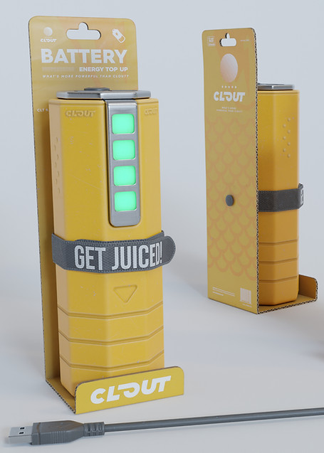
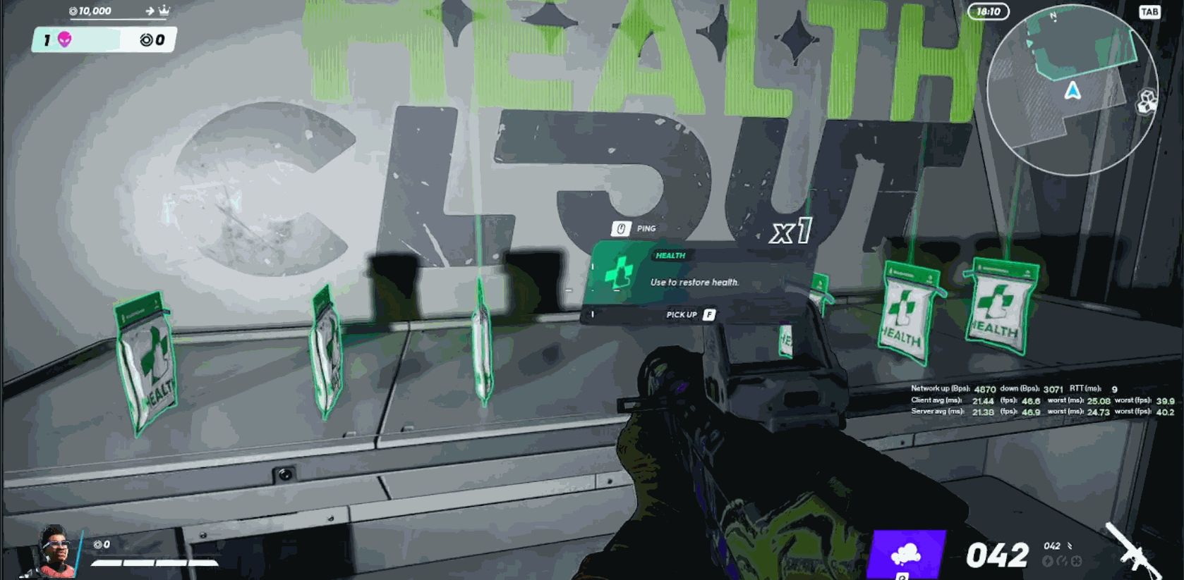
In-Game Branding/ Graphic Design
Accompanying our gadget icons, each gadget's in-game model was thematically branded as an in-universe product of ‘CLOUT’ . I was tasked with proposing and executing on updating our in-game brands.
I worked in tandem with the writing, concept art and 3D art department to ensure tonal & visual cohesion.
I worked in tandem with the writing, concept art and 3D art department to ensure tonal & visual cohesion.
Gadgets
We leveraged the work done earlier establishing a dynamic action shape for the icons and used that as the base for the packaging silhouette. A mood board was assembled to generate ideas for pattern and colour usage.


WELCOME
Welcome visitors to your site with a short, engaging introduction. Double click to edit and add your own text.
THANK YOU
Lets create together! Feel free to reach out to me stevierayca@gmail.com
The Team
Stevie Ray HUNTER
Emir ARKMAN
Andrey PEKARSKIY
Joshua PAYNE
